Client work | Website redesign
San Diego Hunger Coalition
The San Diego Hunger Coalition connects people to food assistance programs across the county. My team redesigned their website to optimize resource flows for their primary audience groups.
The Challenge
Two main audiences shared one cluttered website with no clear paths for either. Community members needed information on food assistance programs, and providers needed educational material to learn how to properly help people.
CTAs were buried and needlessly repeated; navigation labels were vague and unhelpful for first-time users. On top of this, duplicate pages from differently named links sent users like us in circles.
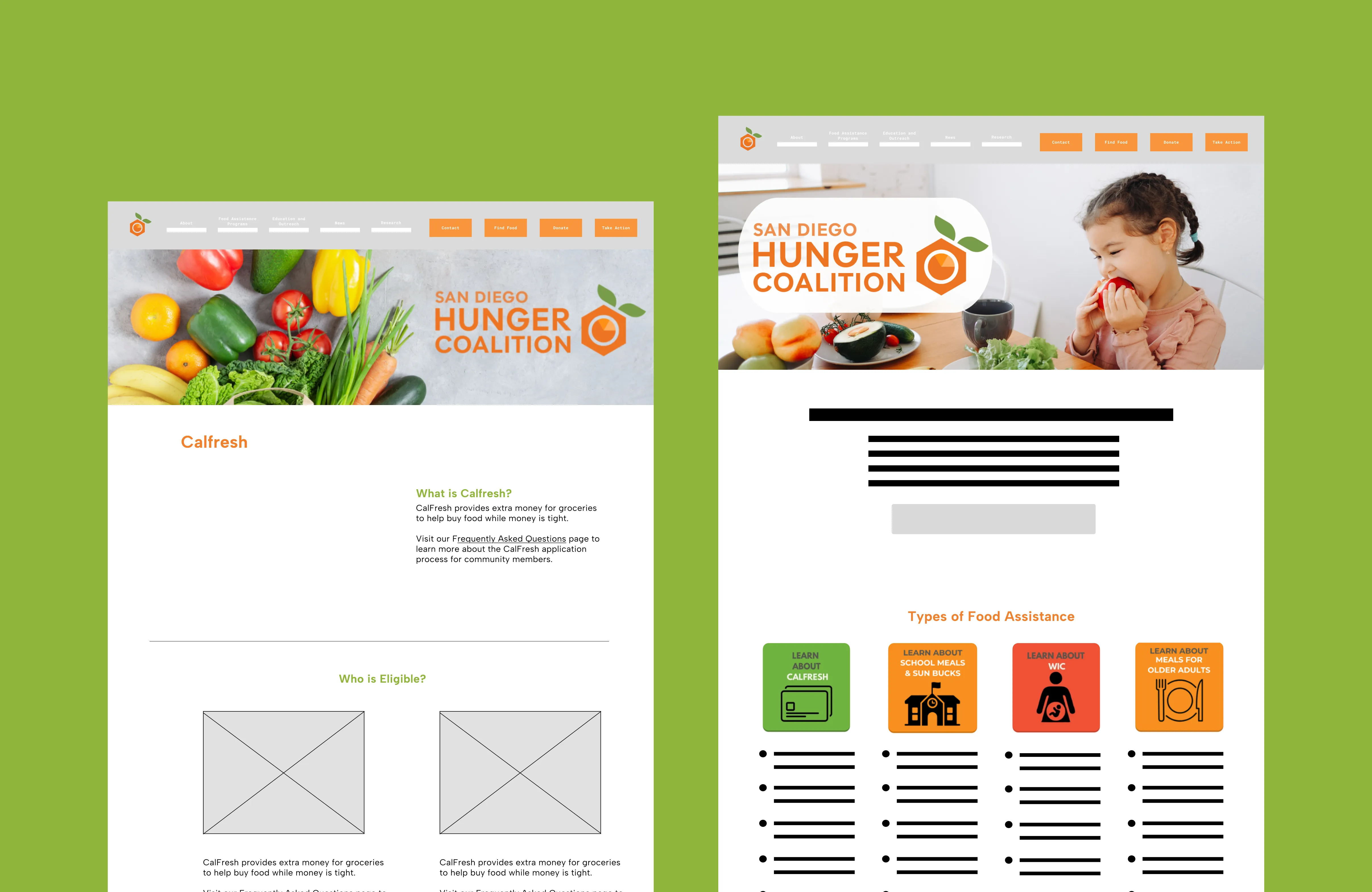
The old website had the right information, but finding it was often a problem.
Research
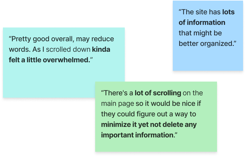
We conducted stakeholder interviews, a 40+ response survey, and a content audit.
The client emphasized the importance of usability over aesthetics, and making information readily available. Users agreed that the website had good information but described the interface with words like “cluttered” and “outdated”. We also explored the site, finding duplicate pages and redundant links.
Our overall takeaway from all our sources was that the website needed clearer labels, separated audience flows, and faster paths to resources.
Our Solution
- 01
Reduced clutter by condensing and chunking information: On the pages we redesigned, we focused on making information easily digestible by using chunking methods to make everything more readable and reducing cognitive load from long scrolls.
- 02
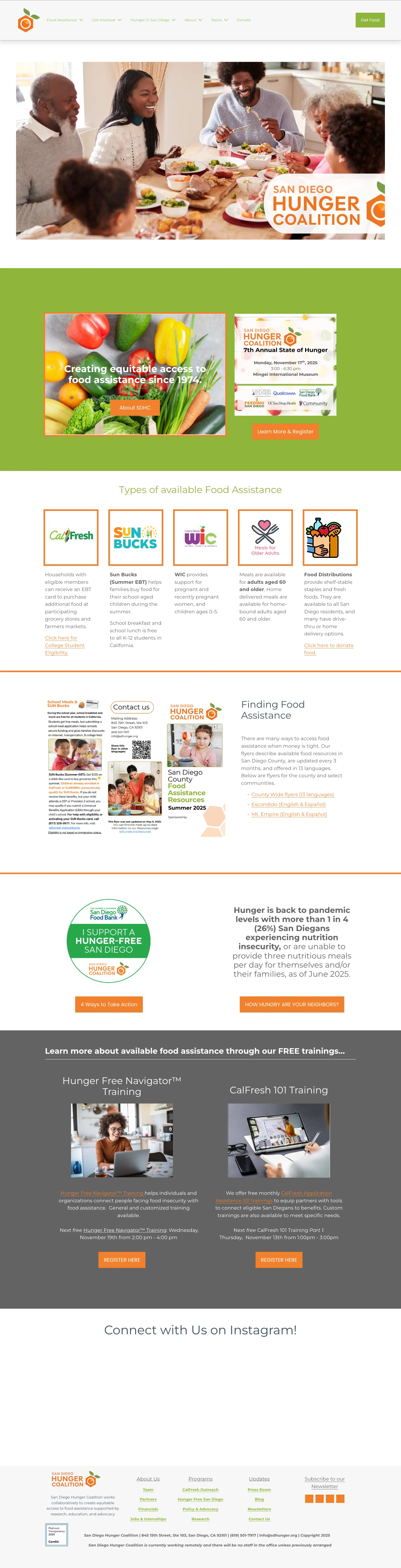
Separated user flows based on demographic: One nav section for community members (Food Assistance Programs), one for providers (Partner Resources), and a “Get Food” CTA meant for community members. Everything else followed from that decision.
- 03
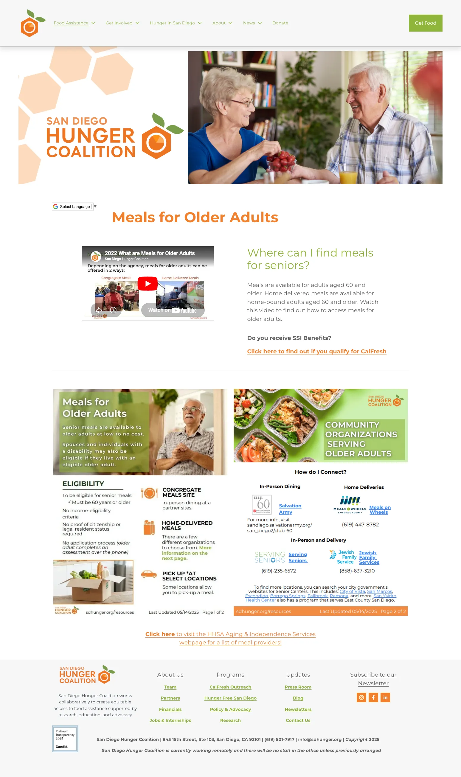
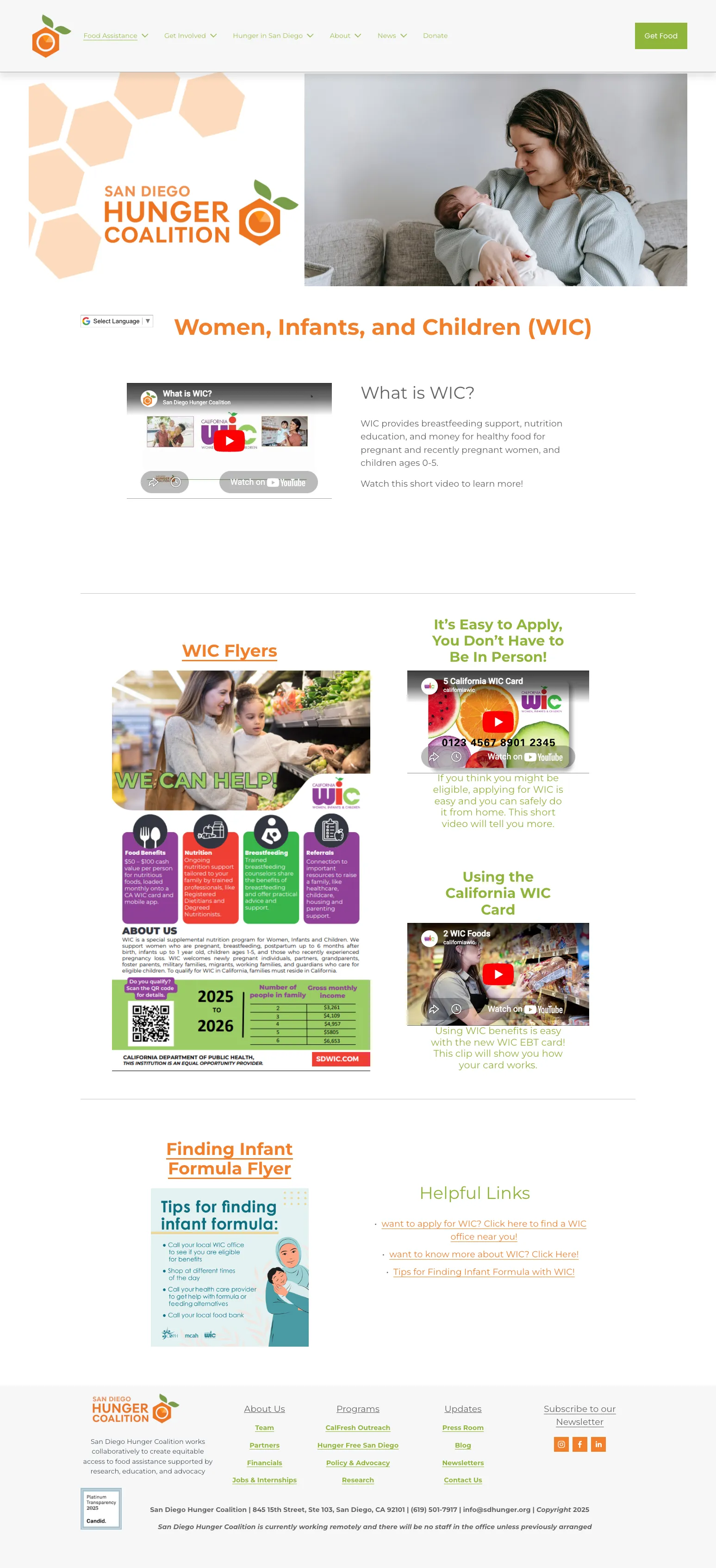
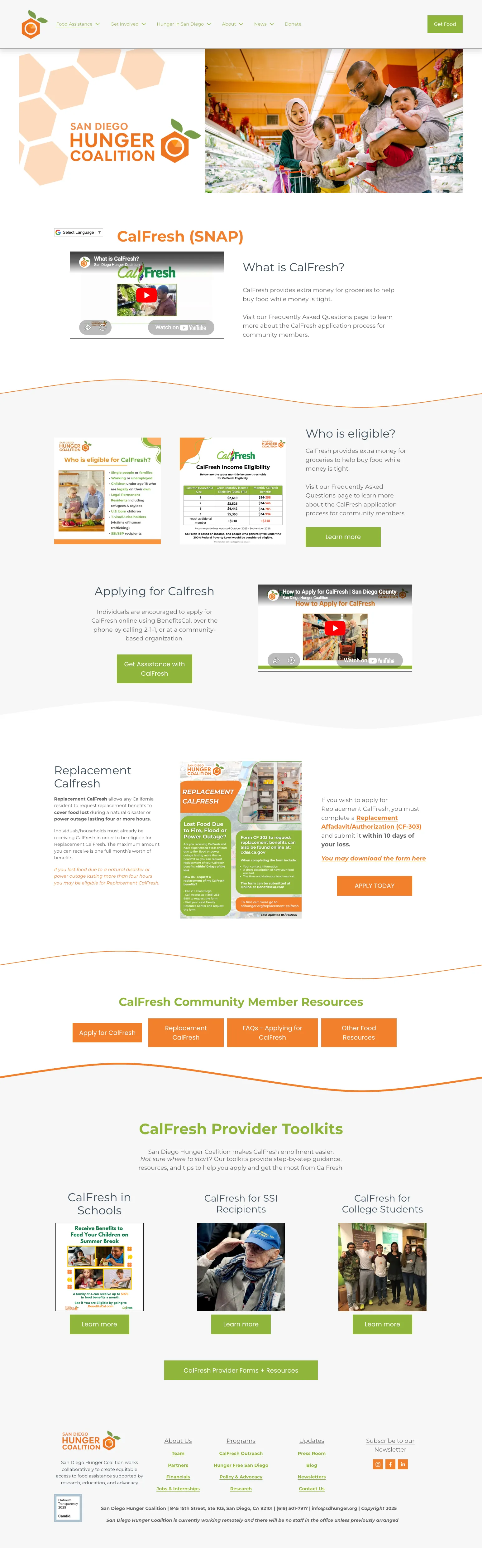
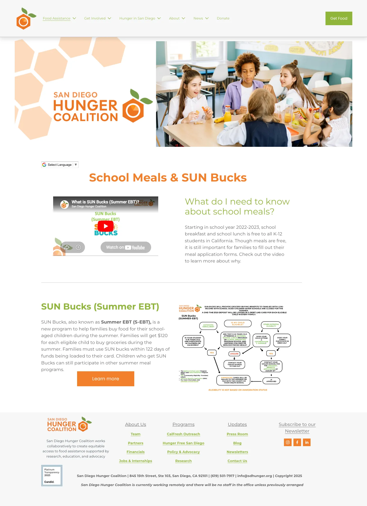
Organized food assistance programs: We simplified the homepage and the page for general program information to focus on eligibility, making it easier for users with different needs to identify useful programs and filter out less applicable ones.
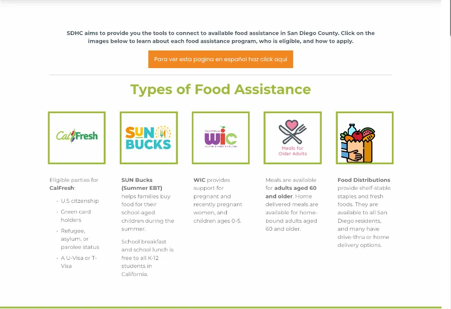
In addition to organizing the landing pages, we made sure that the information on the linked program pages were also structured and easy to digest.
Deliverables
Reorganized Squarespace site
- Priority pages built into template, ready for expansion
- Audience-segmented IA
- Consistent design system across pages
Implementation & handoff guide
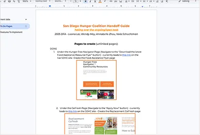
- Lists pages that are still unlinked and elements we couldn’t implement without custom code
- Documents other UI and functionality issues we found
Results
What changed in our redesign?
Audience separated user flows
Fewer clicks to core resources
Information easier to scan
Success for us was defined as clarity, fewer clicks, and maintainability for a lean nonprofit team.
Design Tradeoff
One of the biggest constraints was not the visual direction itself, but how the redesigned site would be implemented and maintained after handoff. The SDHC team had limited engineering resources, so a fully custom build or migration to a more flexible platform would have created more long-term inconveniences for the people managing the site.
We chose to design within Squarespace as a compromise between scalability and creative freedom. This meant simplifying some layout and interaction ideas, but it prioritized a solution the team could realistically launch and maintain on their own.
By making this decision early, we were able to design with the platform in mind instead of forcing a concept that would be difficult to implement. The constraint shaped our design system and handoff decisions, helping the final site stay practical beyond the initial redesign.
Reflection
If I went back in time, here’s what I would do differently:
- 01
Run usability testing before finalizing IA: We validated our decisions through research synthesis, but watching a real user try “Get Food” may have surfaced things we couldn’t anticipate.
- 02
More low-fi iteration before moving into Squarespace: Some structural decisions would have been cheaper to change in Figma; we moved to build relatively quickly, since we were on a tight timeline.