client work | 0→1 Product | Education, CMS
Fulcrum Adventures
Fulcrum Adventures is an LA-based organization that provides experiential education, team building retreats, and leadership development training to groups of all ages.
Context
Fulcrum Adventures has well-developed in-person courses and experiences (think lesson plans for team activities), although these resources are much more fragmented.
They're scattered across different platforms like Drive and PDFs, not optimized for mobile use, and have to be manually distributed by Fulcrum every time they have new content.
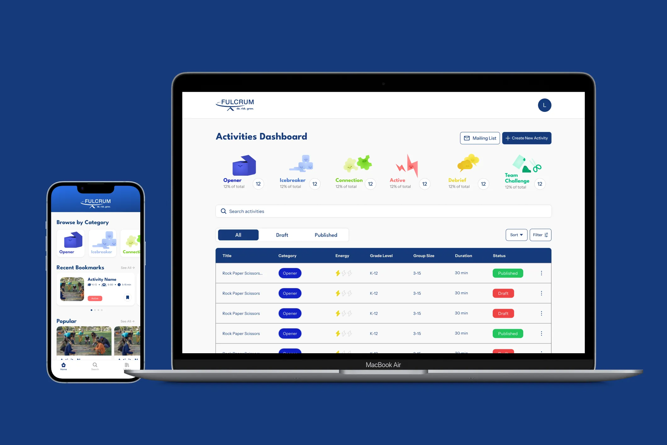
To solve this, we designed and shipped a mobile app that gives facilitators centralized, on-the-go access to Fulcrum's full library of lesson plans and activities — paired with an admin dashboard so their team can manage and publish content without going through developers.
Problem Space
Fulcrum Adventure's facilitators lack a centralized system to quickly find and reference activity plans, since current resources are distributed across different platforms that aren't optimized for on-site use.
What we're solving for:
Faster Prep
Searching for the right activity is time consuming...
Especially when managing a group in real time.
→ Quick access to activity plans through search and filtering.
Admin insights
Admins have no single place to create and manage content...
Activities are distributed manually across platforms.
→ Dashboard where admins can manage activities + visibility on how the content is being used.
Consistent Facilitation
Resources are not consistently organized...
Each facilitator prepares independently from scattered resources.
→ Standardized content and layouts.
Centralized solution on the go
Resources are scattered across binders, PDFs, Drive folders...
None optimized for field use or limited wi-fi.
→ Centralized mobile platform to help bring everything together.
Our Solution
MVP -- User-facing mobile app
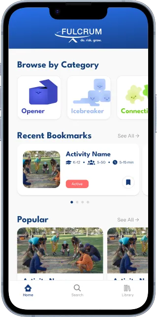
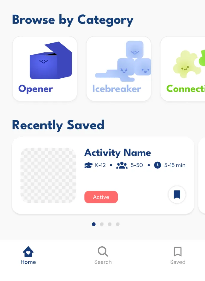
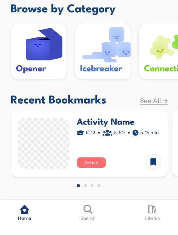
Home - Quick navigation based on recent activity, curated discovery sections for finding new content, and a mailing list signup at the bottom of the page.
Explore - Category cards with custom graphics for visual browsing. Filter by duration, group size, grade level, energy level, environment, and props.
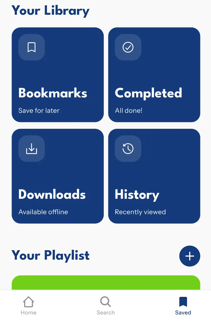
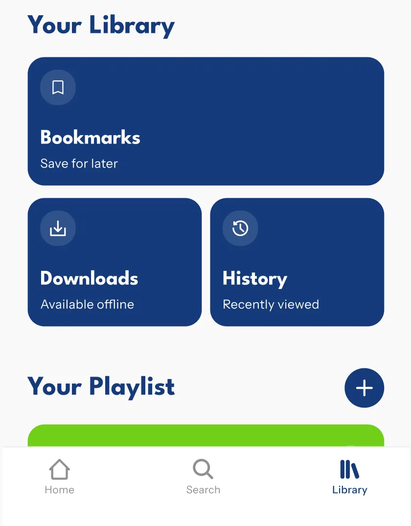
Saved - Bookmark activities, download for offline access, view history, and create playlists for session planning.
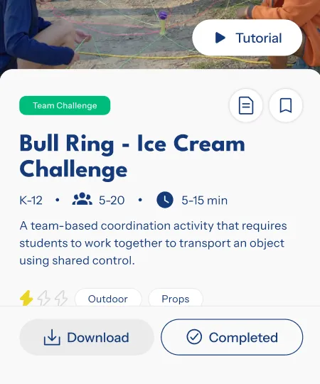
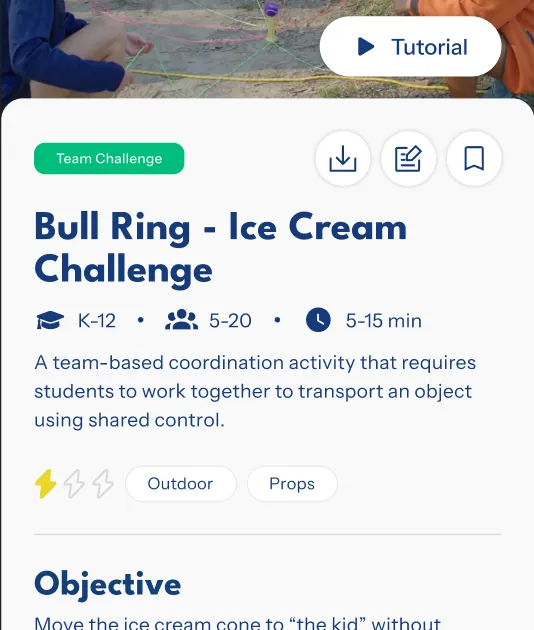
Activity page - Key details up top (grade level, group size, duration, video tutorials). Tabbed layout below for setup, instructions, and debrief — keeps the card compact. Tabs are customizable by the client for activity-specific content.
V2 — Admin CMS dashboard
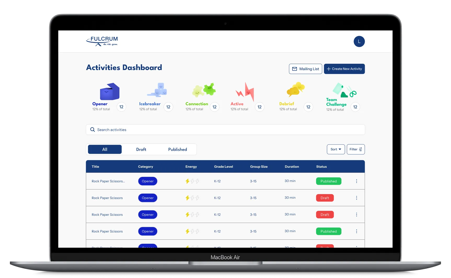
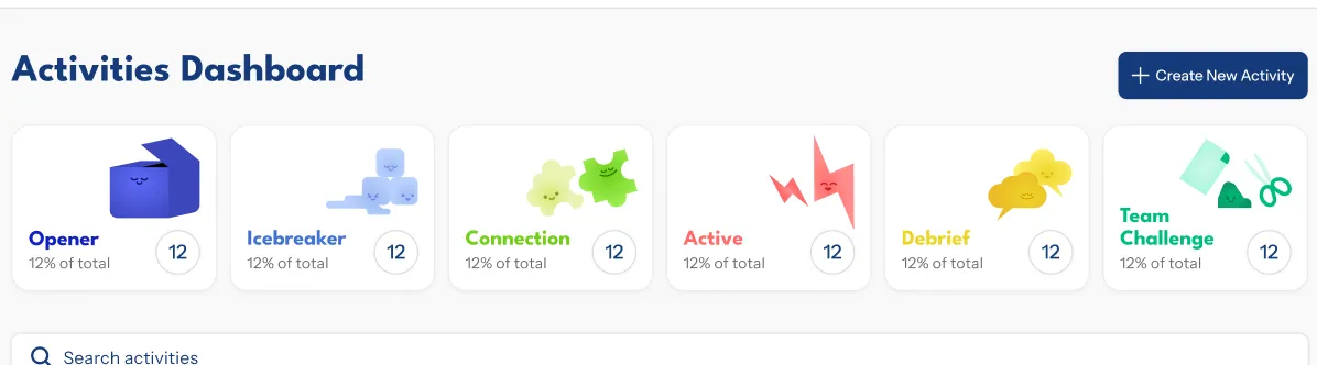
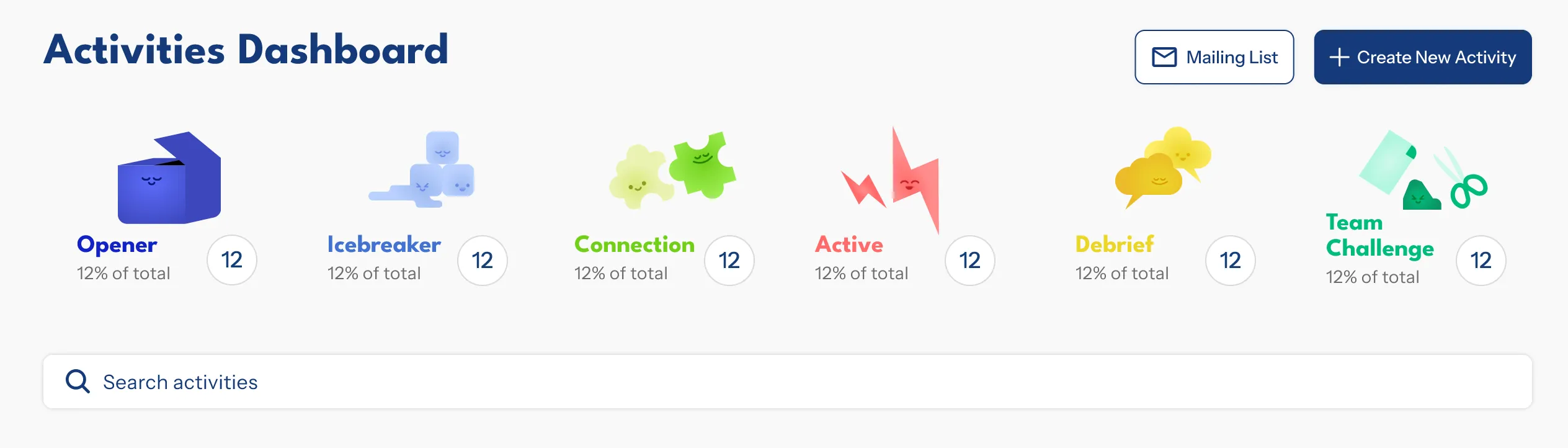
Dashboard - List view for efficient content management. Sort, search, filter, and toggle between drafts and published.
Mailing list - All email signups in one place.
Create activity (basic info) - Cover media upload with cropping and thumbnail selection, plus activity details.
Create activity (content) - Customizable tabs that map to the app's activity layout. Mobile preview before publishing.
Defining success
- Adoption across nonprofits, school partners, and other clients
- Reduced friction in accessing lesson materials
- Improved admin workflow efficiency—streamlined content management through the admin dashboard
Indicators:
- Client Feedback
- App download counts
- Frequency of activity views and saves
- Whether Fulcrum staff continue uploading/managing content
- Whether the app replaces existing workflows
Research
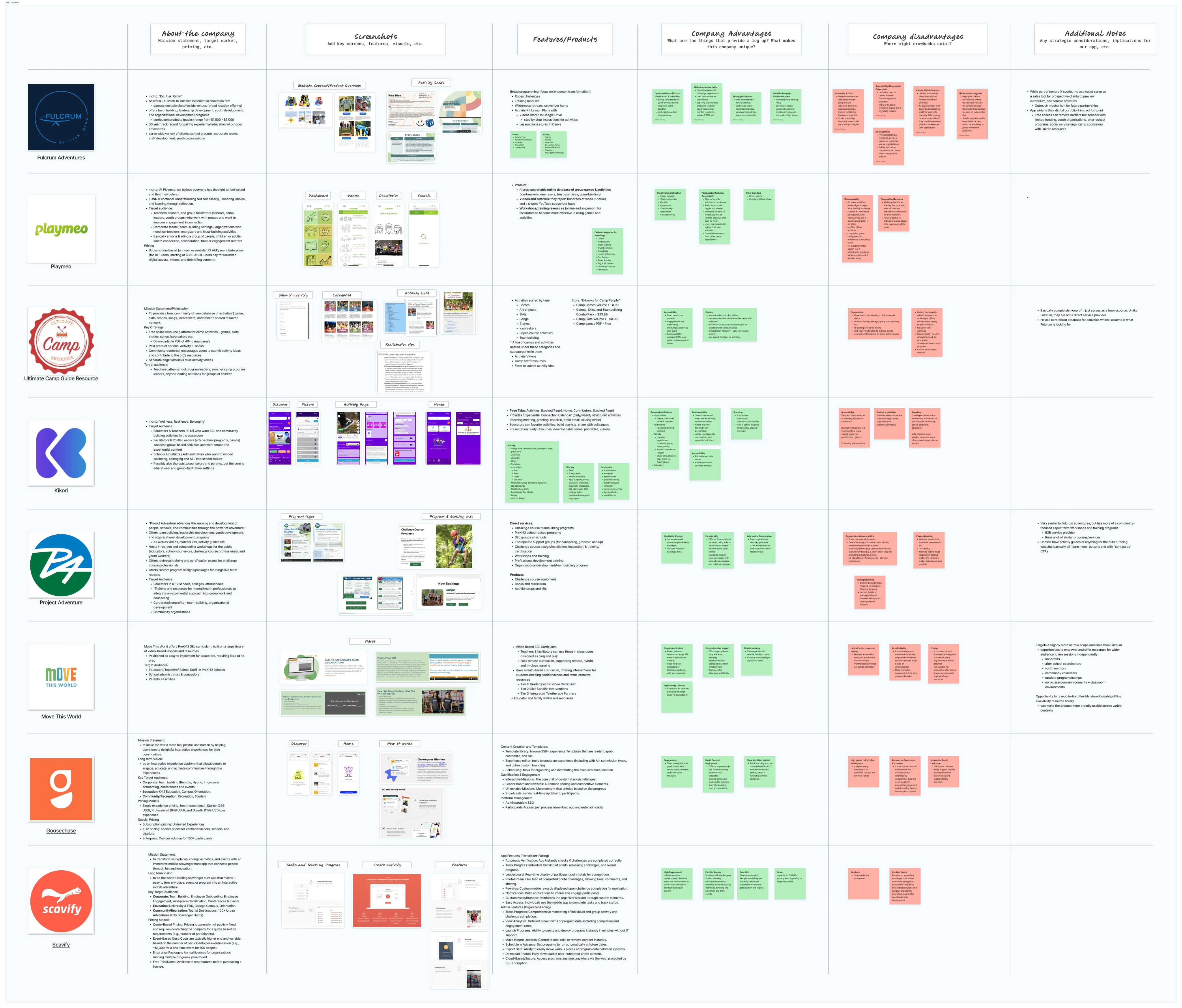
Competitive analysis
We found organizations operating in similar spaces to analyze and inform our design, such as Playmeo, Kikori, Ultimate Camp Resources, and more, to get an idea of what features and patterns worked well.
User Interview Insights
We also interviewed our client, Leo, to learn about his pain points. Here's the gist of it:
Key questions asked:
- How do facilitators access and use activity materials?
- What information is most critical for facilitators to see instantly?
- Walkthrough of new activity creation process
- Most important items to see on admin dashboard?
- 3–5 most important features for mobile resource app?
Key pain points:
- Hard to remember activity guidelines
- Mixing up similar activities
- Hard to visualize activities from descriptions
- Relies on guess-and-check for finding activities
- Organizing activity instruction into concise write-ups is inefficient and time consuming
Design Process
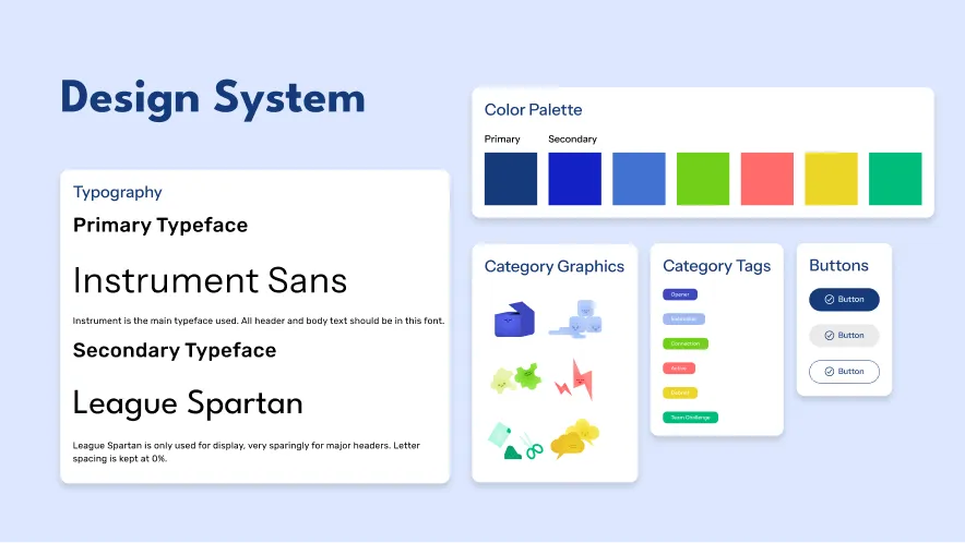
Building onto Fulcrum's brand colors, we identified a visual style that we based our style tokens around, and also designed custom graphics to fit the organization's activity categories.
Structure and flow
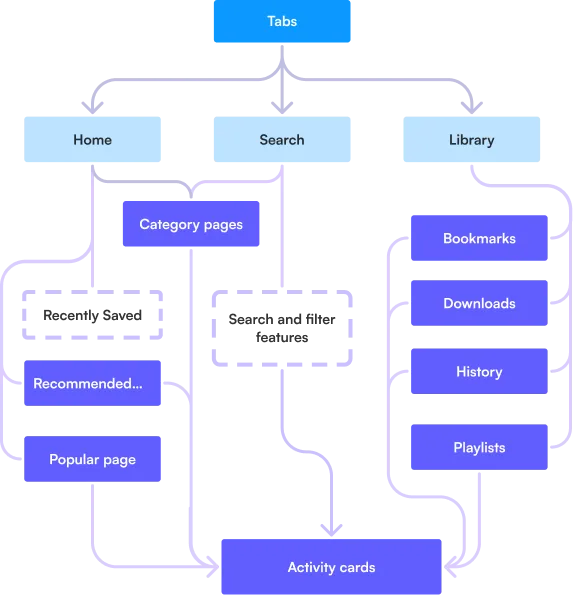
We started with information architecture over user flows because the app supports multiple pathways to the same content: browsing by category, searching with filters, accessing saved items, or jumping back into recent activity. The structure needed to accommodate all of these while keeping the end goal simple: get facilitators to the activity information they need as quickly as possible.
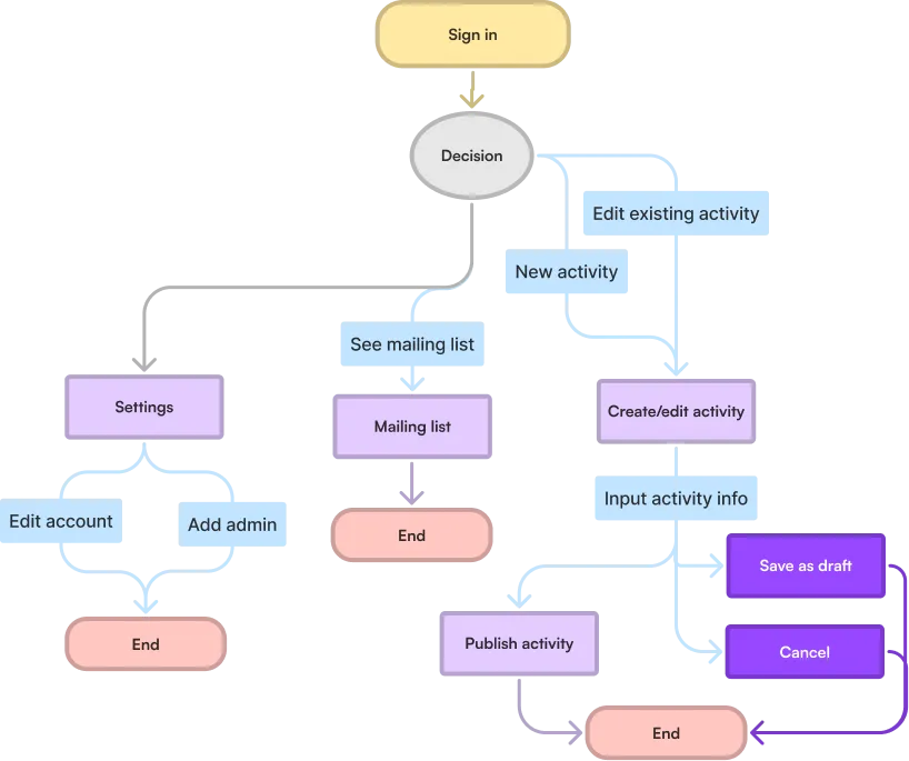
The admin dashboard was more straightforward, so we moved directly into mid-fidelity designs and refined the flows as we went. Its core purpose is efficient activity management (creating, editing, saving drafts, and publishing) with a connected mailing list that pulls signups from the app.
User testing
After each handoff phase, we conducted user testing on our prototypes to identify areas of friction in both the MVP and V2 products. The feedback directly shaped several design changes like removing confusing features and clarifying terminology across the app.
MVP app adjustments
1. "Activity Completed" functionality
Feedback:Confusion with saved vs completed activities
Adjustment:Remove complete functionality and condense all buttons to the top for clarity and space
2. Confusion in terms used
Feedback:Ambiguity between saved, bookmarks, and playlists (overlap between names, functions, icons)
Adjustment:Clarified naming and resolved overlaps. New icon and name for page in the nav bar.
V2 dashboard adjustments
1. Dashboard category metrics
Feedback:Metrics cards were misleading since they looked interactive/clickable
Adjustment:We made them read less as buttons by reducing elevation effects and making them sit on the page.
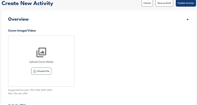
2. Upload cover media flow
Feedback: Multi-field flow was confusing. Button functions weren't clear. Section title "Thumbnail" was also unclear.
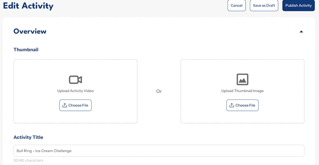
Adjustment: Single upload field, functions based on file type, hover tooltips, and a more concise section title.
Feasibility-related pivot
In the final development sprint, our developers found that storing large volumes of video files in the database wasn't sustainable. After consulting with the client, they switched the activity cover system from local video uploads to YouTube embeds.
This meant the existing media flow was no longer applicable, and the entire interaction model needed to be reworked around a URL-based input instead of a file upload. The redesign for the feature is currently in progress as we wrap up the project.
Constraints
Timeline
Our timeline didn't allow for everything the client wanted. We cut 3 feature ideas, one of which already had a completed set of designs, so developers could focus on shipping the core product. The tradeoff was discarding nice-to-haves that likely wouldn't have been fully polished, in favor of higher quality on the most important features.
Limited user research
We had limited access to facilitators — the primary users who would run activities through the app. Without them, we leaned on secondary research, client input, and internal assumptions. These gave us enough direction to move forward, but we couldn't fully validate our decisions against real user behavior.
Looking back, our team could have benefited from pursuing alternative recruitment channels or proxy interviews earlier, rather than relying solely on the client for user access.
Takeaways
Here are some lessons that my team and I learned from the process: